The 48-Hour Digital Product Blueprint

Create a clean, professional infographic illustration in a full-bleed 3:2 aspect ratio with a modern startup aesthetic, white background, deep navy text, teal and orange accent colors, bold sans-serif typography, and clear visual hierarchy.

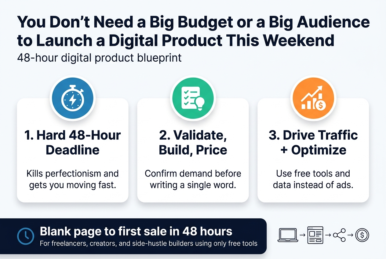
Top full-width header bar: large bold title text, centered-left, exact text: "You Don't Need a Big Budget or a Big Audience to Launch a Digital Product This Weekend" with a small subtitle beneath in lighter weight text: "48-hour digital product blueprint"

Main layout: wide horizontal three-column section across the center, each column inside a rounded rectangle block with a simple icon at the top and numbered heading.

Left column:
Blue circular icon with a stopwatch and lightning bolt.
Bold heading text: "1. Hard 48-Hour Deadline"
Short body text below: "Kills perfectionism and gets you moving fast."

Center column:
Green circular icon with a checklist and lightbulb.
Bold heading text: "2. Validate, Build, Price"
Short body text below: "Confirm demand before writing a single word."

Right column:
Orange circular icon with a growth chart and dollar sign.
Bold heading text: "3. Drive Traffic + Optimize"
Short body text below: "Use free tools and data instead of ads."

Bottom full-width callout band with a subtle dark navy background and white text. Include a small clock icon on the left and a bold statement:
"Blank page to first sale in 48 hours"
Smaller line beneath: "For freelancers, creators, and side-hustle builders using only free tools"

Add a bottom-right small visual cluster of simple line icons: laptop, product page, social share, and coin, arranged horizontally with thin connector arrows.

Style details: clean grid, balanced spacing, no vertical poster layout, no clutter, no decorative borders, strong contrast, crisp flat vector shapes, soft shadows, minimal gradients, professional infographic design.

You Don’t Need a Big Budget or a Big Audience to Launch a Digital Product This Weekend

If you’ve been sitting on a product idea for months — tweaking, researching, waiting until it feels “ready” — this guide is for you. Specifically, it’s for freelancers, creators, and side-hustle builders who have real skills and zero dollars to spend, but want to turn what they know into something people will actually pay for.

The 48-hour digital product blueprint is a hour-by-hour plan that takes you from blank page to first sale using only free tools. No paid ads. No expensive software. No excuses left by Sunday night.

Here’s what you’ll walk away knowing:

  • Why a hard 48-hour deadline is actually your best friend — and how it kills the perfectionism loop that keeps most creators stuck
  • How to validate, build, and price your product before you write a single word — so you’re not building something nobody wants
  • How to drive real traffic and optimize your conversions using data — without spending a dollar on ads

If you’ve watched other people sell digital products online while you keep “getting ready,” that gap is costing you real money every month. Let’s close it.

Why the 48-Hour Deadline Is Your Most Powerful Tool
Create a clean, professional full-bleed infographic illustration in 3:2 aspect ratio with a wide horizontal layout, modern sans-serif typography, bold hierarchy, and a crisp business-style color palette of deep navy, teal, white, and warm orange accents.

Top full-width header bar with large bold title text: "Why the 48-Hour Deadline Is Your Most Powerful Tool"

Below the title, divide the design into three wide horizontal sections with clear visual separation and icons.

LEFT SECTION:
Large stopwatch icon with "48h" inside it.
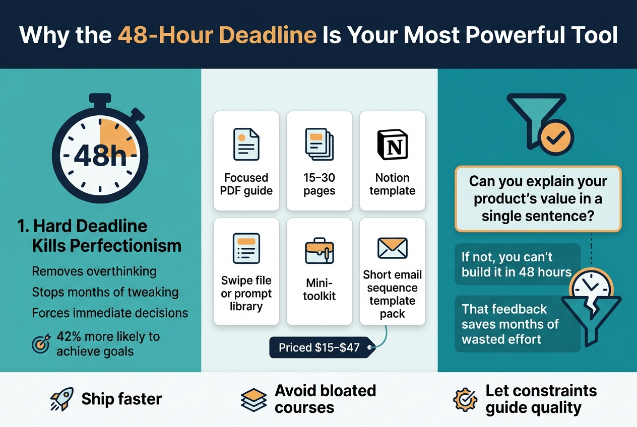
Heading: "1. Hard Deadline Kills Perfectionism"
Subtext in short lines:
"Removes overthinking"
"Stops months of tweaking"
"Forces immediate decisions"
"42% more likely to achieve goals"
Use a small upward arrow or target icon next to "42% more likely to achieve goals".

CENTER SECTION:
Grid of five product cards with small icons, arranged in two rows, each card with a simple line icon and label:
"Focused PDF guide"
"15–30 pages"
"Notion template"
"Swipe file or prompt library"
"Mini-toolkit"
"Short email sequence template pack"
Add a small price tag label near the bottom of this section:
"Priced $15–$47"
Include a subtle shopping cart or dollar icon.

RIGHT SECTION:
Large filter/check icon with a single-line prompt in a highlighted box:
"Can you explain your product's value in a single sentence?"
Below it, two stacked short statements:
"If not, you can't build it in 48 hours"
"That feedback saves months of wasted effort"
Add a broken clock or funnel icon to show weak ideas being filtered out.

At the bottom, include a thin summary band across the full width with three compact callout blocks and icons:
"Ship faster"
"Avoid bloated courses"
"Let constraints guide quality"

Use strong contrast, clear spacing, clean alignment, subtle shadows on cards, minimal decorative lines, and a polished infographic style. Keep all text legible and exact as written.

How a Hard Deadline Kills Perfectionism and Forces Action

A 48-hour deadline removes your ability to overthink. Without a fixed endpoint, you’ll spend months tweaking, waiting, and never shipping. Research shows people who set goals with specific deadlines are 42% more likely to achieve them. Your hard deadline eliminates endless A/B testing and forces immediate decisions instead.

What You Can Realistically Build and Sell in 48 Hours

Within 48 hours, you can build products that sell daily, including:

  • A focused PDF guide (15–30 pages)
  • A Notion template with genuine utility
  • A swipe file or prompt library
  • A mini-toolkit
  • A short email sequence template pack

Priced between $15–$47, these products generate first sales faster than bloated, expensive courses ever could.

Why Tight Constraints Filter Weak Ideas Before You Waste Time

With this in mind, the 48-hour rule acts as your earliest quality filter. Ask yourself one question: Can you explain your product’s value in a single sentence?

If you can’t, you can’t build it in 48 hours — and that’s valuable feedback before you waste your time. Tight constraints expose weak ideas immediately, saving you from months of wasted effort.

Hours 0-4: Validate Your Idea Before Writing a Single Word
Create a full-bleed infographic illustration in a clean modern editorial style, aspect ratio 3:2, with a wide horizontal layout and no poster frame or inset margins. Use a white background with bold accents in navy blue, teal, warm yellow, and coral. Use a professional sans-serif font with strong hierarchy, crisp vector shapes, and subtle shadows.

TOP HEADER ACROSS FULL WIDTH:
Bold title in large navy text at the top center-left: "Hours 0-4: Validate Your Idea Before Writing a Single Word"
Small subtitle beneath in gray: "Where to Find Real Problems, Confirm Demand, and Set Pricing Fast"

SECTION 1 on the left half, labeled with a blue circle icon containing a magnifying glass and the number "1":
Header text: "Find Real, Painful Problems"
Include a search bar style graphic with small platform icons for Reddit, Quora, and Facebook Groups.
Show three quoted search phrases as stacked callouts:
"I wish there was a template for..."
"Does anyone have a resource for..."
"I keep wasting time on..."
Add a bold note in a yellow highlight box: "Look for recurring frustrations a digital product could solve in under 30 minutes"
Add a smaller emphasis line in dark text: "Specificity wins — 'a Notion weekly planner for freelance designers juggling multiple clients' beats 'productivity help' every time."

SECTION 2 in the center-right, labeled with a green circle icon containing a shopping bag and the number "2":
Header text: "Confirm Market Demand"
Show marketplace icons for Gumroad, Etsy, and Creative Market in a row.
Add a list-style callout with a checkmark icon: "Existing listings with reviews confirm real demand"
Add a red warning box with an exclamation icon: "If nothing exists in your niche, treat that as a red flag, not a hidden opportunity"

SECTION 3 along the lower full-width band, labeled with a coral circle icon containing a price tag and the number "3":
Header text: "Set the Right Price Point in Under Five Minutes"
Show a two-column pricing table with bold headers:
"Price Range" | "Best For"
"$9–$15" | "Impulse buys — single templates, checklist bundles"
"$27–$47" | "Recurring professional problems — full toolkits, strategic frameworks"
Add a bold closing line beneath the table in dark navy on a light gray strip: "Decide in five minutes and move forward. Overthinking pricing kills momentum before your product even exists."

Use clear visual hierarchy, bold section headers, simple icons, rounded cards, and ample spacing. Make the left section and center-right section sit side by side, with the pricing section spanning the bottom width. Keep all text sharp, legible, and exactly as written.

Where to Find Real, Painful Problems People Will Pay to Solve

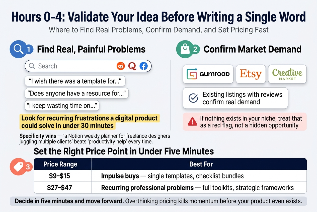
Search Reddit, Quora, or niche Facebook groups using phrases like:

  • “I wish there was a template for…”
  • “Does anyone have a resource for…”
  • “I keep wasting time on…”

Look for recurring frustrations a digital product could solve in under 30 minutes for your buyer. Specificity wins — “a Notion weekly planner for freelance designers juggling multiple clients” beats “productivity help” every time.

How to Confirm Market Demand Using Gumroad, Etsy, and Reddit

With this in mind, search Gumroad, Etsy, or Creative Market for similar products. Existing listings with reviews confirm real demand. If nothing exists in your niche, treat that as a red flag, not a hidden opportunity.

How to Set the Right Price Point in Under Five Minutes

Now that you’ve confirmed demand, lock in your price using this simple framework:

Price Range Best For
$9–$15 Impulse buys — single templates, checklist bundles
$27–$47 Recurring professional problems — full toolkits, strategic frameworks

Decide in five minutes and move forward. Overthinking pricing kills momentum before your product even exists.

Hours 4-20: Build a Sellable Product Using Only Free Tools
Create a clean professional infographic in 3:2 aspect ratio with a full-bleed layout, wide horizontal sections, no poster frame, no narrow centered stack. Use a modern SaaS style with white background, navy and teal accents, light gray dividers, and bold sans-serif typography.

Top header across the full width: large bold title text: "Hours 4-20: Build a Sellable Product Using Only Free Tools" with a smaller subtitle beneath: "The Complete Zero-Cost Tech Stack That Professional Creators Use".

Main upper-middle section in two columns:
Left column titled "Zero-Cost Tech Stack" with six rounded cards and simple icons beside each tool:
"Notion" — "Templates, wikis, trackers"
"Canva (free tier)" — "PDF guides, workbooks, covers"
"Google Docs" — "Long-form writing"
"ChatGPT (free)" — "Outlines, drafts, titles"
"Gumroad" — "Selling and delivery"
"Carrd" — "One-page landing page"
Add a small badge near this section: "Many six-figure creators use this exact stack".

Right column titled "Build a Notion Template in Under 8 Hours" with a numbered vertical checklist using checkmark icons:
"1. Duplicate an existing Notion page or start blank"
"2. Structure it around a clear workflow"
"3. Add toggle blocks with instructions"
"4. Design a cover page in Canva using clean palettes"
"5. Test by duplicating and using the template yourself"
"6. Export via 'Duplicate to your Notion'"

Lower-left section titled "Compelling PDF Guide Structure" shown as a horizontal page-sequence graphic with three grouped blocks:
"Pages 1–3" — "Cover, problem, target audience"
"Pages 4–20" — "Frameworks, steps, checklists"
"Pages 21–23" — "Summary, next steps, resources"
Add a small note below: "Keep it under 25 pages"
Include small visual markers of page thumbnails.

Lower-right section titled "Why the Cover Matters" with a large mock cover card and a sparkle/star icon. Show the cover card text exactly:
"8 Chapters | 12 AI Prompts | $0 Cost to Launch"
Add two short callout lines beside it:
"15 minutes of work"
"People judge content by its container"
Include a small Canva-style cover template icon.

Use clear section headers, numbered blocks, thin arrows between steps, and simple flat icons. Maintain strong visual hierarchy, generous spacing, and crisp readable text throughout.

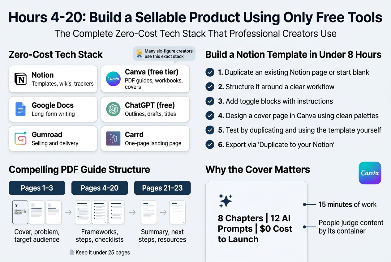
The Complete Zero-Cost Tech Stack That Professional Creators Use

Your entire product business runs on these free tools:

Tool Purpose
Notion Templates, wikis, trackers
Canva (free tier) PDF guides, workbooks, covers
Google Docs Long-form writing
ChatGPT (free) Outlines, drafts, titles
Gumroad Selling and delivery
Carrd One-page landing page

Many six-figure creators still use this exact stack. Upgrade your idea, not your tools.

Step-by-Step Process to Build a High-Value Notion Template in Under 8 Hours

  1. Duplicate an existing Notion page or start blank
  2. Structure it around a clear workflow (first, second, third steps)
  3. Add toggle blocks with instructions
  4. Design a cover page in Canva using clean palettes
  5. Test by duplicating and using the template yourself
  6. Export via “Duplicate to your Notion”

How to Structure a Compelling PDF Guide That Buyers Actually Read

Keep your guide under 25 pages using Canva’s document templates:

  • Pages 1–3: Cover, problem, target audience
  • Pages 4–20: Frameworks, steps, checklists
  • Pages 21–23: Summary, next steps, resources

Write short paragraphs, use headers, and include one visual per major section.

Why a Professional Cover Image Transforms How Buyers Perceive Your Product

Your cover is your highest-ROI investment — just 15 minutes of work. PDFs without covers look like homework. A branded cover with a clear title and stats bar like “8 Chapters | 12 AI Prompts | $0 Cost to Launch” instantly signals value. People judge content by its container. Use Canva’s free ebook cover templates to get started.

Hours 20-28: Build a Landing Page That Converts Without Spending a Dollar
Create a full-bleed 3:2 landscape infographic illustration with a clean modern SaaS style, white background, navy and teal accents, orange highlights, bold sans-serif typography, clear spacing, and strong visual hierarchy.

Top center title in large bold text:
“Hours 20–28: Build a Landing Page That Converts Without Spending a Dollar”

Under the title, create three wide horizontal content blocks across the page, not a narrow vertical poster.

LEFT WIDE PANEL, titled in a blue header bar:
“A. The Six-Section Minimum Viable Landing Page Structure”
Add a small Carrd-style website mockup with six stacked horizontal sections, each with a simple icon and numbered label:
1. “Headline” — outcome icon
2. “Problem block” — frustrated face icon
3. “What’s included” — checklist icon
4. “Social proof” — badge icon
5. “Price and CTA” — button icon
6. “FAQ” — question mark icon

Include a small note beneath the mockup in bold:
“Use Carrd’s free plan to build your page in under 30 minutes.”

Add a three-question callout box with speech bubble icons:
“What is this?”
“Who is it for?”
“Why buy now?”

Add a warning strip at the bottom of the panel with a red accent:
“Avoid adding extra elements—they reduce conversion.”

CENTER PANEL, titled in a teal header bar:
“B. How to Write Headlines That Lead With Outcomes, Not Features”
Show a side-by-side comparison table with two columns and a downward arrow between them.

Left column header in muted gray:
“Weak (Feature-Led)”
Text in a pale card:
“A Notion Template for Freelancers”

Right column header in green:
“Strong (Outcome-Led)”
Text in a highlighted card:
“Stop Rebuilding Your Client Workflow Every Monday — A Notion Template That Does It For You”

Place a small upward trend arrow and target icon beside the strong headline.

RIGHT PANEL, titled in an orange header bar:
“C. How to Build Social Proof When You Have Zero Testimonials”
Show a credibility card with a shield/check icon and the bold subheading:
“Use specificity instead:”

Add two bullet callouts with quotation marks:
“Built from 3 years of freelance client management”
“Used this exact system to onboard 12 clients last quarter”

Add a bottom note in smaller text:
“Specific claims signal credibility far more than vague promises.”

Use icons throughout: landing page blocks, checklist, button, question mark, shield, checkmark, target, upward arrow, speech bubbles, and a small website cursor. Keep the layout wide, balanced, and easy to scan, with all text crisp and legible.

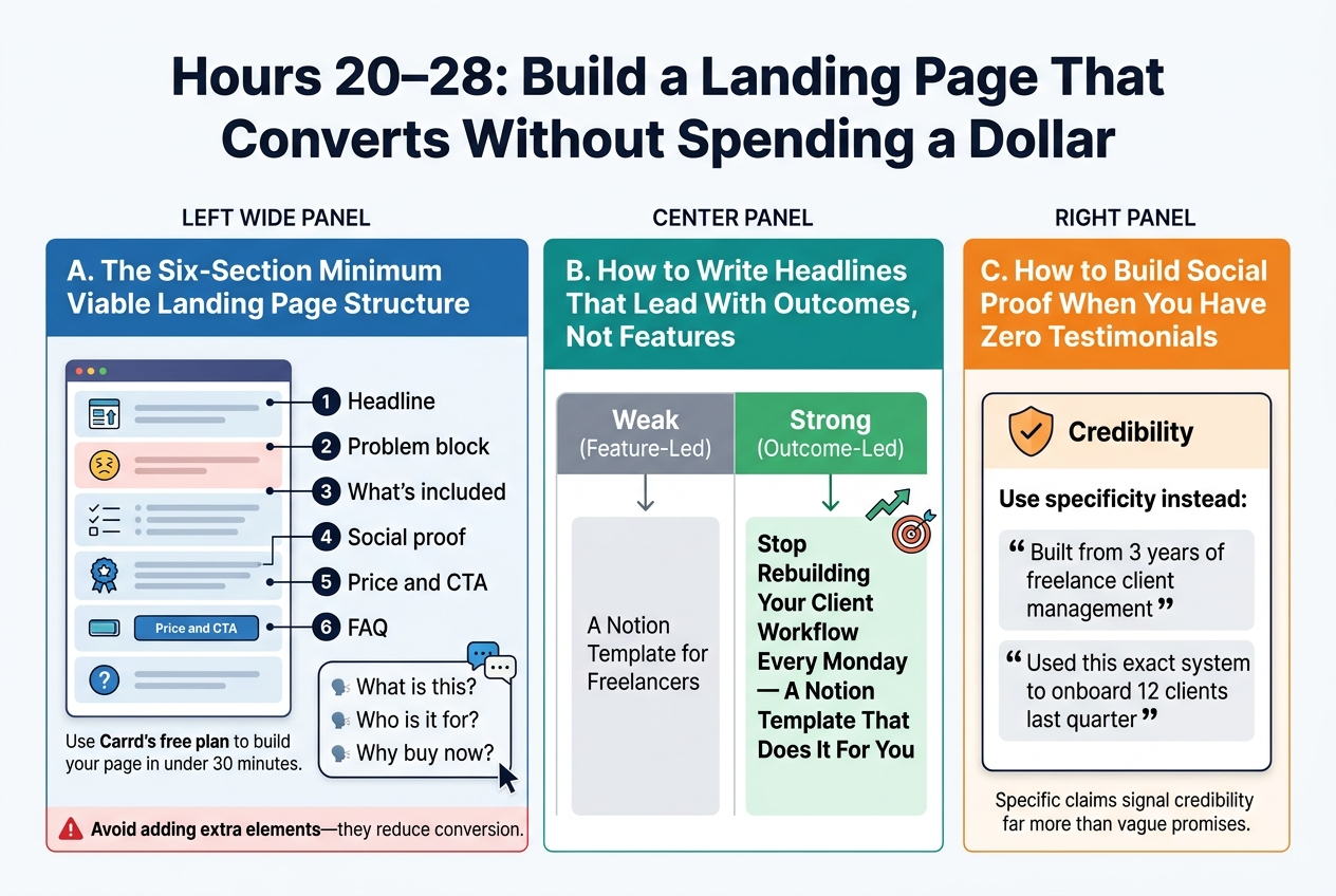
A. The Six-Section Minimum Viable Landing Page Structure

Use Carrd’s free plan to build your page in under 30 minutes. Your landing page must answer three questions: What is this? Who is it for? Why buy now? Structure it with exactly these six sections:

  1. Headline – Lead with the outcome
  2. Problem block – Mirror your buyer’s frustration
  3. What’s included – Specific deliverables in bullet form
  4. Social proof – Build credibility without testimonials
  5. Price and CTA – Single button linking to Gumroad
  6. FAQ – Address your top three objections

Avoid adding extra elements—they reduce conversion.

B. How to Write Headlines That Lead With Outcomes, Not Features

Your headline should sell the result, not the product. Compare these two approaches:

Weak (Feature-Led) Strong (Outcome-Led)
“A Notion Template for Freelancers” “Stop Rebuilding Your Client Workflow Every Monday — A Notion Template That Does It For You”

C. How to Build Social Proof When You Have Zero Testimonials

With this in mind, you don’t need customer reviews to establish trust. Use specificity instead:

  • “Built from 3 years of freelance client management”
  • “Used this exact system to onboard 12 clients last quarter”

Specific claims signal credibility far more than vague promises.

Hours 28-36: Drive Traffic and Sales With Zero Ad Budget
Create a clean, modern infographic illustration in a full-bleed 3:2 landscape layout with a bright white background, deep navy headings, teal and orange accent colors, and clear sans-serif typography.

Top header across the full width:
Bold title text: "Hours 28-36: Drive Traffic and Sales With Zero Ad Budget"
Smaller subtitle beneath: "How to Leverage Communities Where You Already Found Your Buyers"

Arrange the content in four wide horizontal sections or a 2x2 grid with generous spacing, not a narrow vertical stack.

Section 1 on the upper left:
Blue chat bubble icon and Reddit/Facebook-style community icons.
Heading: "1. Return to Communities"
Body text in short lines:
"Answer questions genuinely"
"Mention your product as a helpful resource"
"Never spam"
Small supportive label: "Converts better than cold promotion"

Section 2 on the upper right:
Orange X/Twitter bird icon and a visual post mockup card.
Heading: "2. Use X Visual Posts"
Include a small screenshot-style product card, a short text line, and a link line.
Body text:
"A screenshot of your product in action"
"One sentence naming the exact problem it solves"
"Your direct link"
Small note beneath in teal: "Notion or Canva visuals perform especially well"

Section 3 on the lower left:
Green marketplace/store icons with a compact table-style block.
Heading: "3. List on Free Marketplaces"
Show a simple 2-column mini table with exact text:
"Marketplace"
"Setup Time"
"Gumroad Discover — Automatic"
"Notion Template Gallery — ~1 hour"
"Product Hunt — ~1 hour"
Small footer note: "Passive, compounding traffic over time"

Section 4 on the lower right:
Purple email/envelope icon and a small person-to-person outreach illustration.
Heading: "4. Email Five People Directly"
Body text:
"Identify five people in your network"
"Send a genuine note"
"Explain what you built and why you thought of them"
"Offer a free copy for honest feedback"
Small emphasized line in orange: "Early promoters are worth more than the first few sales"

Add subtle connecting arrows or flow indicators between sections to show progression from community validation to visual posts, marketplaces, and direct outreach. Use clean iconography, strong hierarchy, and balanced spacing. Keep all text crisp, readable, and exactly as written.

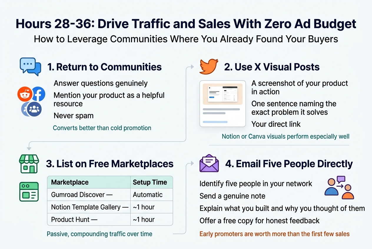
How to Leverage Communities Where You Already Found Your Buyers

Return to the Reddit threads and Facebook groups where you validated your idea. Answer questions genuinely, then mention your product as a helpful resource — never spam. This contextual approach converts far better than cold promotion.

How to Use X (Twitter) Visual Posts to Generate Immediate Clicks

Visual posts consistently outperform plain text on X. Combine:

  • A screenshot of your product in action
  • One sentence naming the exact problem it solves
  • Your direct link

Visuals created in Notion or Canva perform especially well and require zero design budget.

Free Marketplaces That Create Passive, Compounding Traffic Over Time

With this in mind, list your product on platforms that generate ongoing discovery:

Marketplace Setup Time
Gumroad Discover Automatic
Notion Template Gallery ~1 hour
Product Hunt ~1 hour

These listings work passively long after your 48-hour sprint ends.

Why Emailing Five People Directly Outperforms a Broadcast Launch

Now that we’ve covered passive channels, go personal. Identify five people in your network who match your ideal buyer. Send each a genuine note explaining what you built and why you thought of them. Offer a free copy for honest feedback — early promoters are worth more than the first few sales.

Hours 36-44: Use Real Data to Optimize Conversions Fast
Create a full-bleed landscape infographic in 3:2 aspect ratio with a clean modern SaaS style, white background, dark navy typography, teal and blue accents, and subtle light-gray dividers. Use bold sans-serif fonts with strong hierarchy.

Top header across the full width:
Large bold title text: "Hours 36-44: Use Real Data to Optimize Conversions Fast"
Smaller subtitle beneath: "The Key Metrics to Track in Your First 12 Hours Live"

Main layout: two wide horizontal sections side by side, with the left section slightly larger than the right.

LEFT SECTION: "Track the Data"
Add a blue analytics dashboard icon near the section title.
Include a 3-row metric block with clear labels, short descriptions, and benchmark callouts, styled like a clean table with icons:
1. A chart icon next to bold text: "Views vs. Sales"
   Smaller text: "Your conversion rate"
   Benchmark pill in red/amber: "Below 1% = problem"
   Benchmark pill in green: "2–5% = solid"

2. A traffic funnel or source icon next to bold text: "Traffic Source"
   Smaller text: "Which posts or communities are working"
   Green callout text: "Double down on top sources"

3. A page/document icon next to bold text: "Page Visits Without Purchase"
   Smaller text: "Abandonment point"
   Orange callout text: "Rewrite first 50 words of description"

Below the table, add a bold highlighted note box with a warning icon:
"Visitors clicking through but not buying?"
"Your headline or price is the likely culprit."
"Rewrite the opening 50 words of your product description immediately."

RIGHT SECTION: "Add a Video Preview"
Add a play button icon inside a video frame.
Large bold subheading: "How a 60-Second Video Preview Can Lift Conversion Rates by Up to 40%"
Under it, create a simple 3-step visual flow with icons:
A laptop/video icon with text: "60 to 90 seconds"
A hand showing a template/PDF icon with text: "Walk viewers through your template or PDF"
A shield or reassurance icon with text: "I’m not sure this is what I think it is."

At the bottom of the right section, add a strong green result banner:
"Potential 20–40% lift in conversions"
Smaller supporting text: "Zero cost using Loom's free plan."

Use clean grid alignment, wide spacing, crisp vector shapes, minimal shadows, and professional data-visualization styling. Avoid decorative clutter. Make the infographic readable, balanced, and polished.

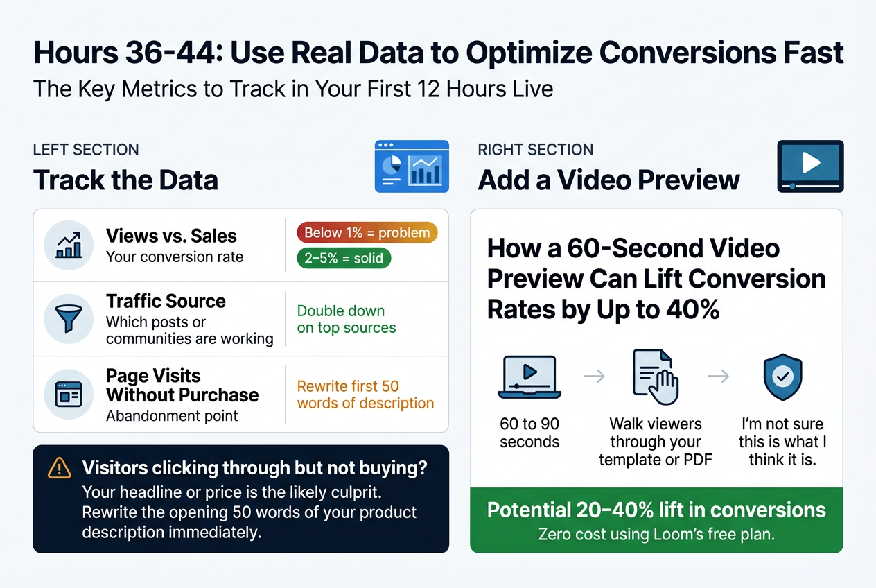
The Key Metrics to Track in Your First 12 Hours Live

Now that your landing page is live, your first job is reading the data — not guessing. Use Gumroad’s built-in analytics to monitor these critical signals:

Metric What It Tells You Benchmark
Views vs. Sales Your conversion rate Below 1% = problem; 2–5% = solid
Traffic Source Which posts or communities are working Double down on top sources
Page Visits Without Purchase Abandonment point Rewrite first 50 words of description

If visitors are clicking through but not buying, your headline or price is the likely culprit. Rewrite the opening 50 words of your product description immediately to address that friction.

How a 60-Second Video Preview Can Lift Conversion Rates by Up to 40%

With this in mind, one of the highest-leverage moves you can make is adding a short video preview — just 60 to 90 seconds — directly to your Gumroad page. Walk viewers through your template or PDF so they know exactly what they’re getting.

This eliminates the most common buyer objection: “I’m not sure this is what I think it is.” The result? A potential 20–40% lift in conversions, at zero cost using Loom’s free plan.

Hours 44-48: Build the Foundation for Long-Term Digital Product Income
Create a full-bleed 3:2 infographic illustration in a clean modern editorial style, with a soft white background, dark navy text, teal and orange accent colors, subtle light-gray dividers, and bold sans-serif typography. Use a wide horizontal layout with four main content blocks across the canvas, not a vertical poster.

TOP HEADER: Place a large bold headline across the top center-left:
"Hours 44-48: Build the Foundation for Long-Term Digital Product Income"
Add a smaller subtitle beneath it:
"How to Turn Buyer Feedback Into a Version 2.0, Build an Email List, Map a Product Ladder, and Repurpose Content"

SECTION 1 on the upper left: a rounded rectangle block with a blue circular icon showing a speech bubble and star. Title:
"1. Turn Buyer Feedback Into Version 2.0"
Include three short bullet lines with checkmark icons:
"List every piece of feedback"
"Identify your top 3 improvements"
"Schedule 1 weekend per month for updates"
Add a small line below in teal:
"Existing buyers get updates free"
And a small orange callout:
"Build loyalty + spark word-of-mouth"

SECTION 2 on the upper middle-right: a rounded rectangle block with a green circular icon showing an email envelope. Title:
"2. Start Your Email List Now"
Include a simple landing page mockup card with text:
"Free bonus resource"
"Enter your email"
Add a small note below:
"Use Mailchimp or ConvertKit free plan"
Add a highlighted stat badge:
"Even 50 subscribers = warm audience for your next launch"

SECTION 3 across the lower left and center: a wider block with a gold circular icon showing stacked product boxes and an upward arrow. Title:
"3. Map a 3-Product Ladder"
Show a clean 3-row table with columns exactly labeled:
"Product"
"Type"
"Price Range"
Rows:
"Product 1 | Entry-level | $9–$27"
"Product 2 | Deeper dive or companion tool | $37–$67"
"Product 3 | Bundled system | $97–$147"
Add a small arrow line beneath the table:
"Product 1 buyers become warm leads for Product 2"

SECTION 4 on the lower right: a rounded rectangle block with a purple circular icon showing a recycle arrow and content nodes. Title:
"4. Repurpose One Product Into 5 Content Pieces"
Show a simple flow diagram with arrows and exact labels:
"Landing page copy → Twitter thread"
"PDF introduction → Blog post"
"Notion template workflow → YouTube walkthrough or LinkedIn post"
Add a bold closing line at the bottom of this block:
"Five channels. Zero additional production cost."

Add thin connecting lines or arrows between sections to suggest a growth system. Use small icons: feedback speech bubble, email envelope, product stack, recycle arrows. Keep the layout spacious, balanced, professional, and easy to read. No borders or framed poster edges.

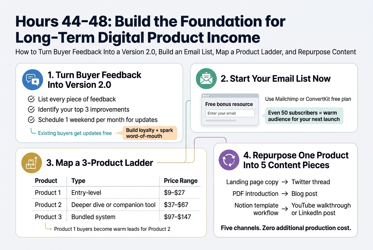
How to Turn Buyer Feedback Into a Version 2.0 That Drives Word-of-Mouth

List every piece of feedback you’ve received and identify your top three improvements. Schedule one weekend per month to release updates — existing buyers get them free, which builds loyalty and sparks word-of-mouth naturally.

Why Starting Your Email List Now Gives Your Next Launch a Head Start

Add a free opt-in to your landing page immediately, offering a one-page bonus resource in exchange for an email address. Use Mailchimp or ConvertKit’s free plan — even 50 subscribers means your next launch already has a warm audience waiting.

How to Map a Three-Product Ladder That Turns a Side Project Into a Business

With this in mind, plan your product ladder strategically:

Product Type Price Range
Product 1 Entry-level $9–$27
Product 2 Deeper dive or companion tool $37–$67
Product 3 Bundled system $97–$147

Buyers of Product 1 become warm leads for Product 2, building a sustainable income stream.

How to Repurpose One Product Into Five Pieces of Content Across Multiple Channels

  • Landing page copy → Twitter thread
  • PDF introduction → Blog post
  • Notion template workflow → YouTube walkthrough or LinkedIn post

Five channels. Zero additional production cost.

The Mindset Shift That Separates Creators Who Earn From Those Who Wait
Create a full-bleed 3:2 infographic with a clean modern SaaS-style design, white background with deep navy text, teal and gold accents, and subtle light-gray dividers. Use bold sans-serif typography, clear hierarchy, and wide horizontal sectioning instead of a narrow centered stack.

Top across the full width: a large bold heading in dark navy, left-aligned:
"The Mindset Shift That Separates Creators Who Earn From Those Who Wait"

Directly beneath the heading, add a smaller subtitle in medium gray:
"Why Imperfect Products That Ship Always Beat Perfect Products That Don't"

Main body in three wide horizontal sections across the page, each with an icon and short text block:

1) Left wide section with a teal circular icon of a rocket and a small checkmark:
Bold subheading:
"1. Ship Imperfectly"
Body text:
"Every creator earning from digital products first shipped something imperfect."
Smaller emphasized line in a highlighted pill:
"The version in your head is always better than the one that exists."

2) Center wide section with a gold circular icon of a $0 budget tag and a magnifying glass:
Bold subheading:
"2. Validate With $0"
Body text:
"Zero budget forces the validation work that actually predicts success."
Smaller emphasized line in a highlighted pill:
"Your $0 budget isn't a handicap — it's a focusing mechanism."

3) Right wide section with a navy circular icon of stacked product cards and an upward growth arrow:
Bold subheading:
"3. Build a Catalog Over Time"
Body text:
"Each new product creates a fresh entry point for discovery."
Add a simple horizontal mini-chart below with three columns and numbers:
"1 product" → "~35 sales"
"3 products" → "~12 sales each"
"10 products" → "A handful each"
Small closing line beneath the chart:
"Your catalog compounds — driving traffic, building authority, and generating real, lasting income over time."

Include thin arrows or flow indicators moving left to right between the three sections to show progression: ship → validate → compound. Use subtle shadowed cards for each section, lots of spacing, and crisp infographic layout. No extra text beyond the exact quoted copy.

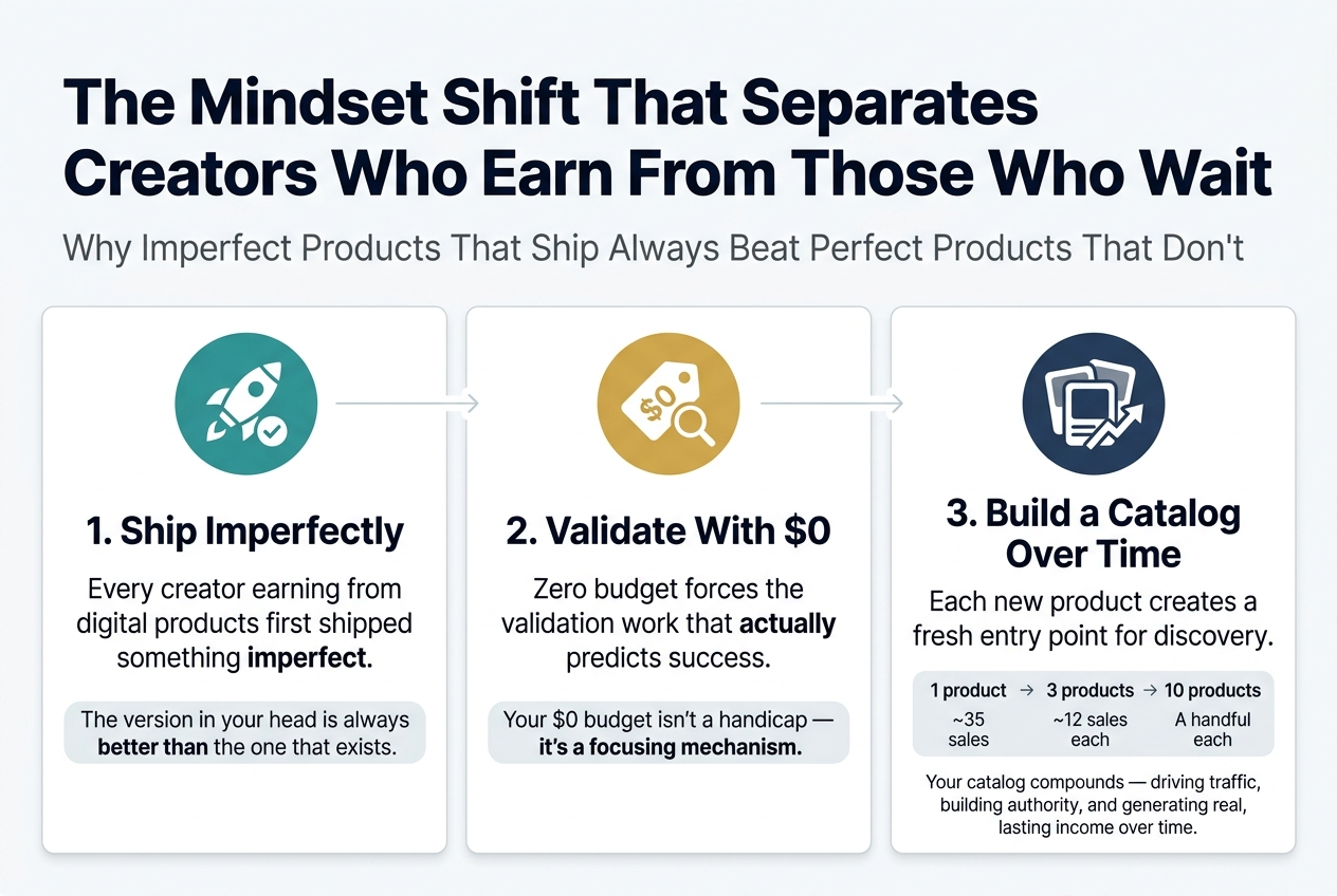
Why Imperfect Products That Ship Always Beat Perfect Products That Don’t

Every creator earning from digital products first shipped something imperfect — a Notion template that started as a personal tracker, a PDF guide with an early typo. The version in your head is always better than the one that exists, but only the existing version can make a sale.

How a Zero-Budget Constraint Forces the Validation Work That Actually Predicts Success

Your $0 budget isn’t a handicap — it’s a focusing mechanism. Without money to spend on tools and ads, you’re forced to validate whether people actually want your product. This essential work is what funded launches often skip, which is why zero-budget launches frequently outperform them in early stages.

The Compound Math Behind Building a Catalog of Digital Products Over Time

Now that we’ve covered validation and shipping, consider what happens when you stack products over time:

Products in Catalog Sales Needed Each (to hit $1,000/month at $29)
1 product ~35 sales
3 products ~12 sales each
10 products A handful each

Each new product creates a fresh entry point for discovery. With this in mind, your catalog compounds — driving traffic, building authority, and generating real, lasting income over time.
Create a clean, professional full-bleed infographic illustration in a 3:2 aspect ratio, using a wide horizontal layout with no poster frame and no centered vertical stack. Use a dark navy-to-charcoal background with electric blue, teal, and white accents, modern sans-serif fonts, and strong visual hierarchy.

At the top, place a large bold title in white: "Conclusion"

Below the title, arrange five wide horizontal sections across the canvas in a left-to-right flow with numbered blocks, connected by a thin line and subtle arrows. Use clear icons above each block.

Section 1 on the left: a magnifying glass icon and a red Reddit-style discussion icon. Include the text:
"1. Validate the idea"
"Open Reddit"
"Find the frustration"
"Confirm demand in the first 4 hours"

Section 2 next: a laptop, code, and free tools icon. Include the text:
"2. Build with $0 tools"
"$0 tech stack"
"Build the product fast"
"Use free tools that work"

Section 3 in the center: a megaphone, share, and traffic arrows icon. Include the text:
"3. Drive traffic for free"
"No ad spend"
"Post, share, and reach users"
"Spend a dollar: $0"

Section 4 next: a chart with upward line, analytics dots, and checklist icon. Include the text:
"4. Optimize with real data"
"Track what converts"
"Improve based on results"
"Use post-launch data"

Section 5 on the right: a live product window, checkmark, and coin/star icon. Include the text:
"5. Get the first sale"
"Live product"
"Converting landing page"
"Proof that strangers will pay"

Along the bottom, add a bold highlighted banner spanning the width with a split left-right emphasis. On the left, show a small lightning bolt and clock icon with the text:
"48-hour blueprint"
On the right, show a bold statement in white and teal:
"The only thing missing is execution"

Add a secondary bottom callout strip with an open-launch icon and a forward arrow, containing this exact text:
"Ship imperfect work over polishing something that never launches"
"Start with Hour 0"

Use crisp spacing, clean icons, subtle glow accents, and strong contrast. Keep all text legible, aligned, and organized into clearly separated blocks.

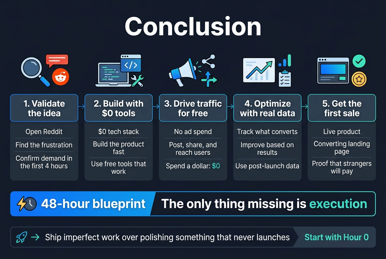
The 48-hour blueprint you just walked through isn’t theoretical. Every phase — from validating your idea in the first four hours, to building your product with free tools, to driving traffic without spending a dollar, to optimizing with real data — is a proven sequence that removes every excuse standing between you and your first sale. You now have a complete hour-by-hour plan, a $0 tech stack that works, and a post-launch foundation designed to grow into a real product ladder. The only thing missing is execution.

The mindset shift that separates creators who earn from those who wait comes down to one decision: shipping imperfect work over polishing something that never launches. Your first product doesn’t need to be perfect. It needs to exist. Start with Hour 0 — open Reddit, find the frustration, validate the demand, and build the thing. Forty-eight hours from now, you could have a live product, a converting landing page, and proof that strangers will pay for what you know. That proof changes everything that comes after it.




You May Also Like

About the Author: Marian

Marian is a digital creator focused on simple, practical ways to build online income using modern tools and everyday strategies. He shares real experiments, step‑by‑step guides, and helpful insights for beginners who want to start earning online without technical skills. His mission is to make online income accessible, realistic, and easy to understand.

Leave a Reply

Your email address will not be published. Required fields are marked *

Share via
Copy link